MIHAILOVE – GLOBAL BRAND CONSULTANCY | BUSINESS TRANSFORMATION

BRAND VISUAL DESIGN

DESIGN YOUR FUTURE WITH US

Design Practice
perception is designed.

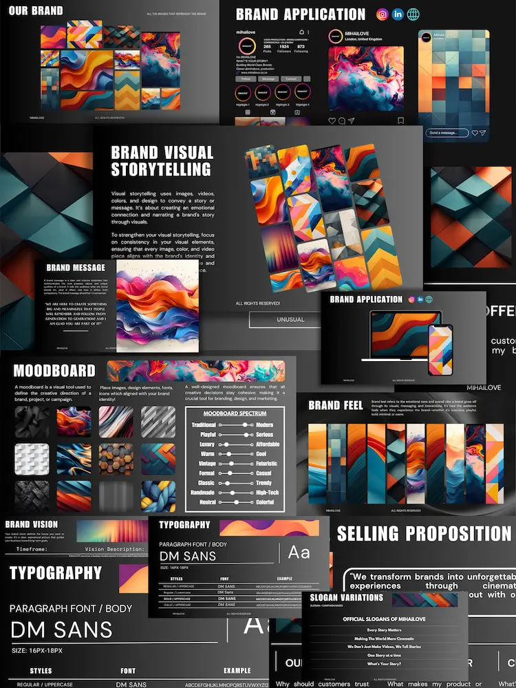
Brand Visual Design defines how a brand is seen, recognised, and remembered. We build design systems, visual assets, and campaign-ready creative that maintain premium consistency across every touchpoint — digital, print, and experience.

Best for: premium identity & assets
Typical timeline: 2–8 weeks
Brand Visual Design Example 1
Brand Visual Design Example 2
Brand Visual Design Example 3
Overview
Brand Visual Design is our system for building a consistent, premium visual language that supports brand strategy and scales across every output — from digital platforms to print and physical experiences.
Design Systems & Guidelines Brand Visual Assets Digital & Campaign Design Event & Experience Design Presentation & Corporate Design Logo & Graphic Design
How it works (phases)
01 — Direction & System
We define the visual logic: hierarchy, layout rules, brand motifs, and the standards your team will execute.
02 — Design & Build
We design assets, templates, and collateral aligned to your use cases across digital, print, and campaigns.
03 — Production & Handover
Production-ready files, correct exports, and structured delivery—so execution stays premium after handover.
Who it’s for (and when it’s urgent)
Best fit
Premium brands and founders who need a cohesive visual identity system that holds quality across every touchpoint.
Urgent if
Your brand looks inconsistent across channels, assets feel ad-hoc, campaigns lack cohesion, or teams produce “off-brand” materials.
Result
A controlled design system and premium asset library that scales—so your brand stays recognisable and high-end everywhere.
What we deliver
Design Systems & Guidelines
A controlled visual language with rules for layout, typography, spacing, and usage—so the brand stays consistent at scale.
Brand Visual Assets
A premium asset kit: motifs, patterns, iconography, supporting graphics, and production-ready templates.
Digital & Campaign Design
Campaign systems and digital layouts for web and social—engineered for clarity, premium hierarchy, and conversion.
Event & Experience Design
Physical brand expression: event collateral, signage concepts, and experience visuals that translate the brand into space.
Presentation & Corporate Design
Corporate decks and template systems that communicate authority—clean hierarchy and consistent execution.
Logo & Graphic Design
Logo refinements, brand marks, and graphic design outputs executed under strict visual standards.
Typical outputs
Design System & Rules
Visual logic, layout rules, spacing, hierarchy, and usage standards.
Brand Asset Kit
Assets, patterns, iconography, and supporting visual elements.
Campaign Template Pack
Repeatable formats for ads, social posts, and campaign systems.
Corporate Deck System
Presentation templates with hierarchy rules for credible communication.
Print / Event Collateral
Collateral layouts and production-ready files for physical brand touchpoints.
Production-Ready Files
Correct exports, formats, and structured delivery for immediate use.
© MIHAILOVE. All rights reserved.
Brand Visual Design
Premium visual systems built to look elite, stay consistent, and scale across every touchpoint — from identity assets to campaign layouts and brand worlds.
Best for: premium brands & launches
Output: identity + layouts + assets
Visual standard
High-contrast clarity, premium typography, disciplined spacing, and finishes that signal quality — clean, modern, and unmistakably intentional.
What it builds
Brand identity assets, campaign design, packaging visuals, social systems, and layout families — engineered to stay consistent across teams and platforms.
Where it performs
Websites, pitch decks, campaigns, packaging, product launches, and premium social presence — everywhere the brand must look credible and expensive.
Swipe / scroll to view
‹ ›
Brand Visual Design image 1
Brand Visual Design image 2
Brand Visual Design image 3
Brand Visual Design image 4
Brand Visual Design image 5
Brand Visual Design image 6
Brand Visual Design image 7
Brand Visual Design image 8
Brand Visual Design image 9
Brand Visual Design image 10
CREDIBILITY

Brands That Trust Us

Our team has had the exclusive opportunity to work with global brands and international organisations, partnering at a senior level to support strategic brand growth, high-impact campaigns, and long-term brand development across multiple markets and industries.

UNITED KINGDOM · UNITED ARAB EMIRATES · KUWAIT · OMAN · SAUDI ARABIA

Verified
PROVEN AT SCALE
Over 70+
5-star
reviews
Google
Verified
95%
Client satisfaction
Trusted by
3
Global
+
Global Brands
150 +
Projects delivered
International
Over
FIVE
International Projects
Experience in
12 +
Industries

CLIENT TESTIMONIALS

Case Studies
Selected Work & Results

Explore selected case studies that demonstrate how we work alongside ambitious brands and leadership teams to deliver strategic clarity, creative excellence, and measurable impact. Each project reflects a brand-led approach across strategy, content, and execution, focused on building long-term value and sustainable growth.

Case Study: Rendoll
Project: Brand Campaign Architecture & Collection Launch Framework
Rendoll logo
Challenges
1
Launch a collection with clear positioning and premium perception
2
Align creative direction with commercial clarity
3
Strengthen trust & credibility through consistency
4
Build one narrative across multiple touchpoints
5
Create assets designed for reuse & continuity
Responsibility
Owned campaign positioning and launch architecture
Set creative and narrative direction across touchpoints
Led campaign film development and production oversight
Built supporting stills and BTS content for rollout continuity
Delivered a governance-ready campaign toolkit for reuse
Outcome

Rendoll’s launch established a clear campaign architecture and a cohesive narrative that held across channels. The work supported commercial performance while strengthening brand credibility. Deliverables were built as a governance-ready toolkit to enable consistency and reuse across future releases.

Results Achieved
+35%
Sales growth during launch

Indicative uplift associated with clear positioning and premium execution.

+40%
Conversion improvement

Supported by one narrative and a clearer decision journey.

50K+
Campaign views

Early momentum driven by a coordinated rollout.

+28%
Returning visitors

Repeat engagement rose as familiarity and confidence strengthened.

10+
Asset deliverables

Hero film, supporting edits, stills, and BTS — designed for repeatable brand use beyond the launch window.

4
Channel deployments

Prepared for website, organic social, paid placements, and owned channels — one narrative across touchpoints.

★★★★★
MIHAILOVE delivered a structured campaign process with high attention to detail. The creative direction remained consistent, execution was precise, and the final assets elevated the launch across multiple touchpoints. Communication was clear, delivery was reliable, and the output reflected the standard expected of premium brands.
Rendoll logo
Ren
CEO
Case Study: Bickley & Mitchell
Project: Commercial Campaign Film & Multi-Channel Asset System
Bickley & Mitchell logo
Challenges
1
Inconsistent brand visuals across touchpoints
2
Limited emotional connection in previous campaigns
3
Low content impact in a competitive market
4
Need for distinct, premium creative direction
5
Short deployment timeline with high-quality expectations
Responsibility
Set premium campaign direction and storytelling standard
Unified brand visual language across all deliverables
Produced channel-ready variations for paid and organic distribution
Designed a shotlist and structure to maximise reuse over time
Delivered fast-turn production with quality control end-to-end
Outcome

The campaign strengthened brand consistency and delivered a clearer, more premium presence across channels. With a unified visual language and a reusable asset system, Bickley & Mitchell improved visibility, reinforced brand perception, and gained assets designed for continued use across paid, owned, and organic placements.

Results Achieved
+42%
Campaign engagement

Stronger attention supported by premium storytelling and clear creative direction.

+31%
Product page visits

Improved intent as content guided viewers toward product exploration.

+48%
Collection discovery

More visitors explored the range after a clearer campaign structure.

+19%
Add-to-cart actions

Higher conversion intent supported by product clarity and confident presentation.

12+
Asset deliverables

A system spanning hero film, variations, stills, and supporting edits — built for reuse.

4
Channel deployments

Content prepared for website, paid, organic social, and owned placements.

★★★★★
Working with MIHAILOVE was an exceptional experience. The commercial output met a high production standard, the creative direction was clear, and the process was professional from end to end. We now have strong assets we can continue to use across multiple channels.
Bickley & Mitchell logo
Sandy
Founder
Case Study: Digital Government Authority (Saudi Arabia)
Project: Institutional Event Media Package (Programme Documentation & Leadership Assets)
Digital Government Authority (Saudi Arabia) logo
Challenges
1
Complex multi-day programme with many moving parts
2
High-end media required for institutional use and external visibility
3
Capture educational value and human impact credibly
4
Limited time for editing & delivery during a live programme
5
Align output with national standards and institutional tone
Responsibility
Owned daily highlight delivery (24h narrative cadence)
Led participant interviews and testimonial capture
Covered certification and recognition moments for leadership use
Built a professional photography library for communications
Delivered a consolidated institutional media package for stakeholders
Outcome

The programme was captured as a polished institutional media package, balancing formal standards with credible participant moments. Daily outputs supported leadership visibility and faster stakeholder alignment, while the final asset library strengthened reputation and long-term usability across future initiatives.

Results Achieved
+55%
Participant engagement

Daily highlights and a consistent narrative increased attention and involvement.

41%+
Faster internal reporting

Next-day recaps supported leadership updates and improved decision speed.

+70%
Programme visibility

High-quality outputs supported internal and external visibility, reinforcing institutional confidence.

400+
Media assets delivered

A usable library for communications, training, and future programmes.

24h
Turnaround cadence

Daily highlights delivered on a next-day rhythm while the programme ran.

1
Institutional narrative

One consistent story across days, stakeholders, and deliverables — aligned to government standards.

★★★★★
MIHAILOVE delivered exceptional quality throughout the entire programme. Their professionalism, attention to detail, and ability to capture the essence of each day were outstanding. The final videos and photos exceeded expectations and will serve as valuable assets for future initiatives.
Digital Government Authority (Saudi Arabia) logo
Mohammed
Project Manager
Case Study: Naddict
Project: Brand Foundation & Identity System (Positioning, Governance & Rollout)
Naddict logo
Challenges
1
No established brand identity or visual direction
2
Unclear positioning and message structure
3
Inconsistent visuals across digital & print touchpoints
4
Need for a distinct, memorable signature look
5
Requirement for a complete brand kit for internal & external use
Responsibility
Defined brand positioning and strategic architecture
Built the core brand story and message structure
Designed a visual identity system and signature look
Delivered a governance-ready brand kit and guidelines
Systemised touchpoints across web, social & print
Outcome

Naddict moved from an undefined presentation to a complete brand foundation: clearer positioning, a signature identity system, and a governance kit designed for consistent rollout. The work strengthened credibility and introduced a repeatable structure for brand management as the business grows.

Results Achieved
1
Brand foundation delivered

Positioning, message structure, and an identity system built as a single coherent brand.

100%
Consistency systemised

One identity applied across web, social, and print with clear rules for rollout.

1
Governance toolkit

Guidelines and asset rules that reduce inconsistency and support brand management.

1
Signature visual language

A distinct look that strengthens recognisability and premium cues.

1
Message clarity

A structured story that improves decision clarity across key pages and touchpoints.

1
Rollout-ready system

Assets and rules prepared for implementation without constant rework.

★★★★★
MIHAILOVE exceeded our expectations with a complete brand transformation. The strategy, identity system, and visual direction gave us clarity, confidence, and a stronger presence. Professional, precise, and highly recommended.
Naddict logo
Alex
CEO

CASE STUDY: NADDICT

Project: Brand Strategy Development

CHALLENGES

OUR SOLUTIONS

OUTCOME

The project resulted in a complete transformation of NADDICT’s brand, delivering a strategic foundation and a visually cohesive identity built for long-term growth. The new brand system fully elevated credibility, improved communication, and positioned NADDICT as a stronger, more recognisable presence in its industry.

RESULTS ACHIEVED

IMPROVED BRAND CLARITY & RECOGNITION​
+ 0 %

Clear positioning and a defined visual system helped NADDICT communicate its value with confidence, significantly enhancing recognition and memorability. The new identity strengthened the brand’s presence across every touchpoint.

INCREASE IN WEBSITE & SOCIAL ENGAGEMENT​
+ 0 %

The refreshed brand identity generated noticeably higher engagement on digital platforms, with clearer visuals and messaging encouraging more interaction, clicks, and time spent on key pages.

BRAND CONSISTENCY ACROSS ALL PLATFORMS​
0 %

The new identity established a unified look and feel across digital channels, presentations, and print materials, creating a strong and cohesive brand presence.

STRONGER BRAND PERCEPTION​
0 %

Feedback collected after launch showed a 72% improvement in how the audience perceived professionalism, quality, and uniqueness, driven by the new strategic identity and visual system.

Case Study: LV Real Estate Developer
Project: Brand Marketing Partnership (Positioning, Messaging & Conversion Structure)
LV Real Estate Developer logo
Challenges
1
Unclear market positioning in a competitive category
2
Inconsistent messaging across digital touchpoints
3
Lack of a clear customer journey and conversion structure
4
Fragmented brand materials and inconsistent quality cues
5
Need for a scalable brand & marketing roadmap
Responsibility
Defined positioning and value proposition
Built a messaging framework and narrative structure
Designed a customer journey and conversion pathway
Set content direction and brand marketing priorities
Built a 12-month roadmap for scalable execution
Outcome

The engagement created a clear market position, a consistent messaging system, and a conversion structure designed to support growth. With a defined roadmap and stronger quality cues, the brand now communicates with greater credibility and operates with a repeatable structure for ongoing execution.

Results Achieved
+68%
In brand clarity & positioning

A clearer value proposition improved how the brand is understood across key touchpoints.

+44%
In messaging consistency

Unified messaging improved trust and recognisability across platforms.

+52%
In lead quality & conversion potential

A clearer journey supported stronger enquiries and improved decision readiness.

30%
Faster in content execution

A clearer structure reduced friction and enabled faster, more consistent content delivery.

1
Unified strategic narrative

One consistent story across channels, improving credibility and clarity.

12m
Roadmap for scalable growth

A prioritised plan supporting sustained execution and long-term consistency.

★★★★★
The brand consultancy provided by MIHAILOVE brought clarity, structure, and a strong strategic direction to our brand. Their insight and guidance transformed how we communicate and position ourselves. Highly recommended for any company serious about growth.
LV Real Estate Developer logo
Luca
Founder